
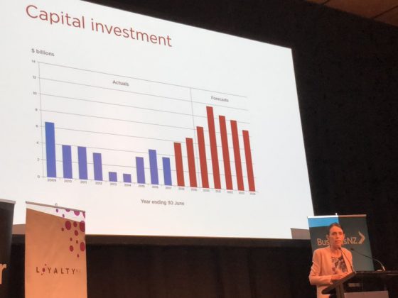
The PM has been using this graph a lot. She used it in presentations. And on Facebook.
But it is misleading as hell. And remember this is the PM who just days ago said she wanted a truthful election campaign.
Here’s the two most dodgy parts of the graph.
- The figures for National have the revenue from partial asset sales deducted from them. It is net capital flows, which is quite different from gross capital investment. So that’s a $4.6 billion difference.
- The figures for Labour include transfers to the NZ Super Fund. That makes up $12.5 billion of Labour’s capital investment. A transfers to the NZ Super Fund to invest in global sharemarkets is not the same as investing in roads, schools and hospitals here.
The PM is trying to fool people into thinking Labour is spending more on infrastructure. In fact Labour’s capital spending in in 2018 and 2019 was less than National was projecting the the 2017 PREFU. Labour spent $300 million less than National was projecting in 2017 and $900 million less in 2018.
Sadly one can’t complain to the Advertising Standards Authority about Jacinda’s dodgy graph because she is only using it on her Facebook page and in presentations.